煌上煌
好事成双鸭礼盒
ART DIRECTOR: 王双龙
DESIGNER: 王双龙、张友、大唐龙猫、Yoan
YEAR: 2023.10
CLIENT: 江西煌上煌集团
In response to the problem of the lack of symbolization in the original brand and the inability to form market differentiation in current products, taking advantage of this packaging upgrade, we will create exclusive graphic symbols for Huangshanghuang to help the brand form a unique visual language.
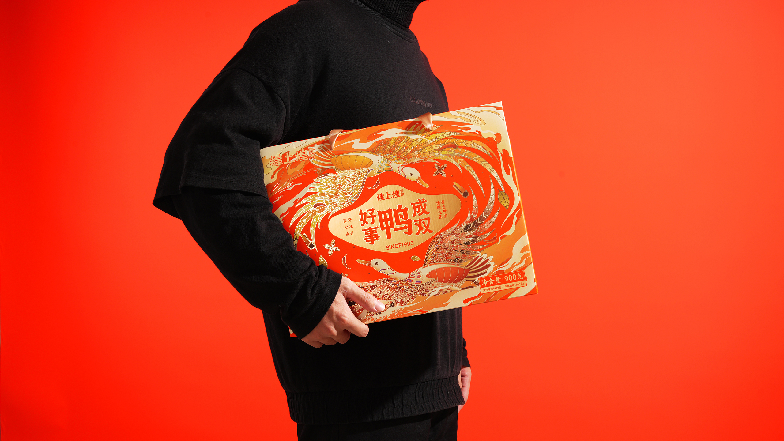
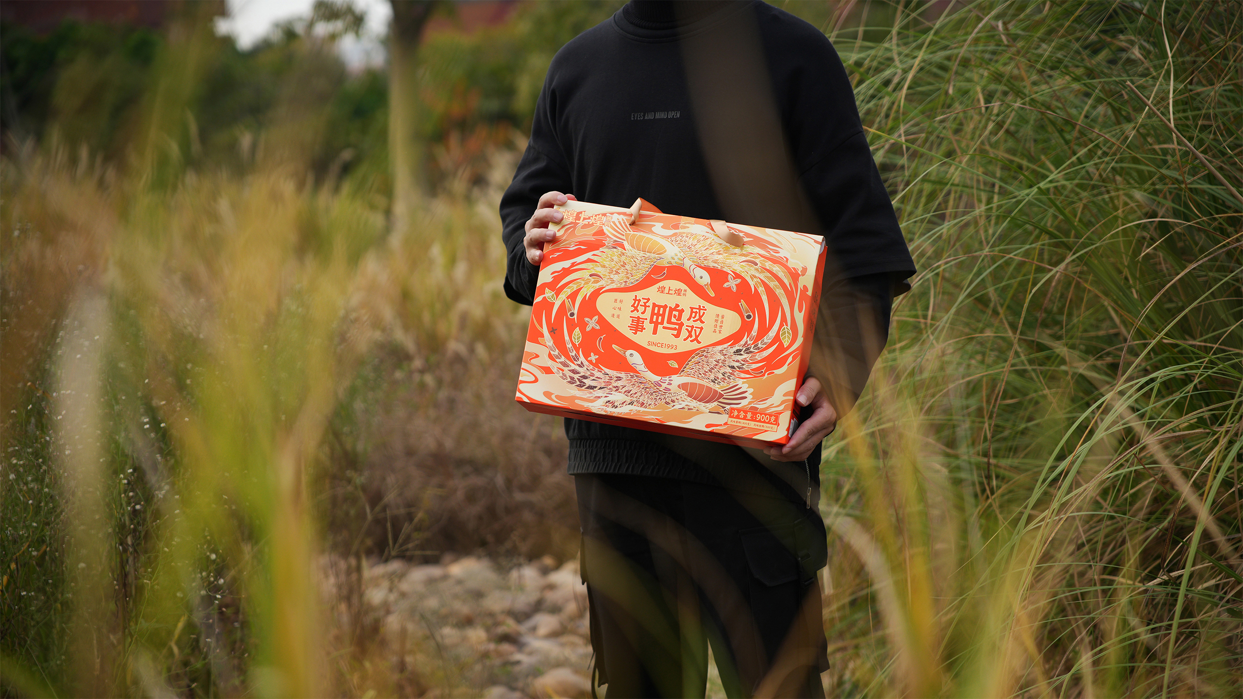
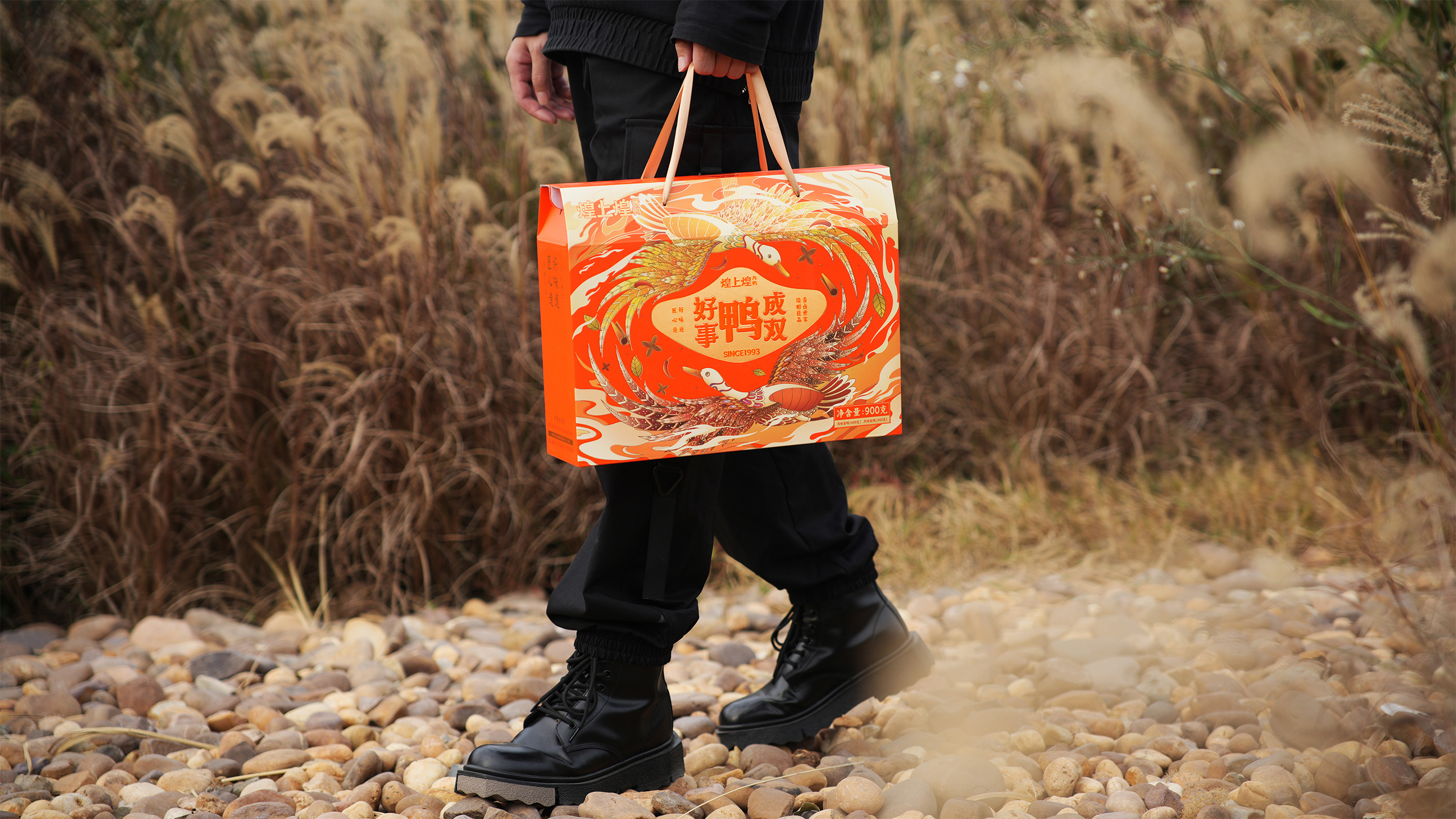
The layout design of New Chinese Aesthetics. Following the traditional Chinese vertical layout, a publishing style hierarchy is constructed through different font sizes. The symmetrical arrangement of information on both sides seeks differentiation in orthodoxy and is more flexible. The main composition of the screen is taken from the traditional Chinese group pattern, consisting of sauce duck and salted duck facing each other, symbolizing reunion and celebration, and fitting the application scenario of gift boxes. And combine auspicious cloud patterns and other brand elements to enrich the overall visual experience.
针对原品牌的无符号化因素和现阶段产品无法形成市场差异化难题,借此次包装升级的契机,为煌上煌打造专属的图形符号,帮助品牌形成专属的视觉语言。
将主食材麻鸭的鸭嘴和鸭掌,提炼成超级符号。鸭嘴,象征用户三十年不变的选择,鸭掌,代表企业三十年坚定的前行。
新中式美学的版式设计。遵循中国正统“竖版编排”版式,通过不同的字号大小构建出版式的层次感。左右对称式的信息编排,在正统中寻求差异化,更加灵活。画面主体构图取自中国传统的团纹,由酱鸭和板鸭相向构成,寓意团圆喜庆之意,贴合礼盒的应用场景。并结合吉祥云纹和其它品牌自身元素,丰富整体视觉。


