青花郎
外盒包装设计
ART DIRECTOR: 王双龙
DESIGNER: 王双龙 / 张友 / 大唐龙猫 / Yoan
YEAR: 2023.05
CLIENT: 四川郎酒股份有限公司
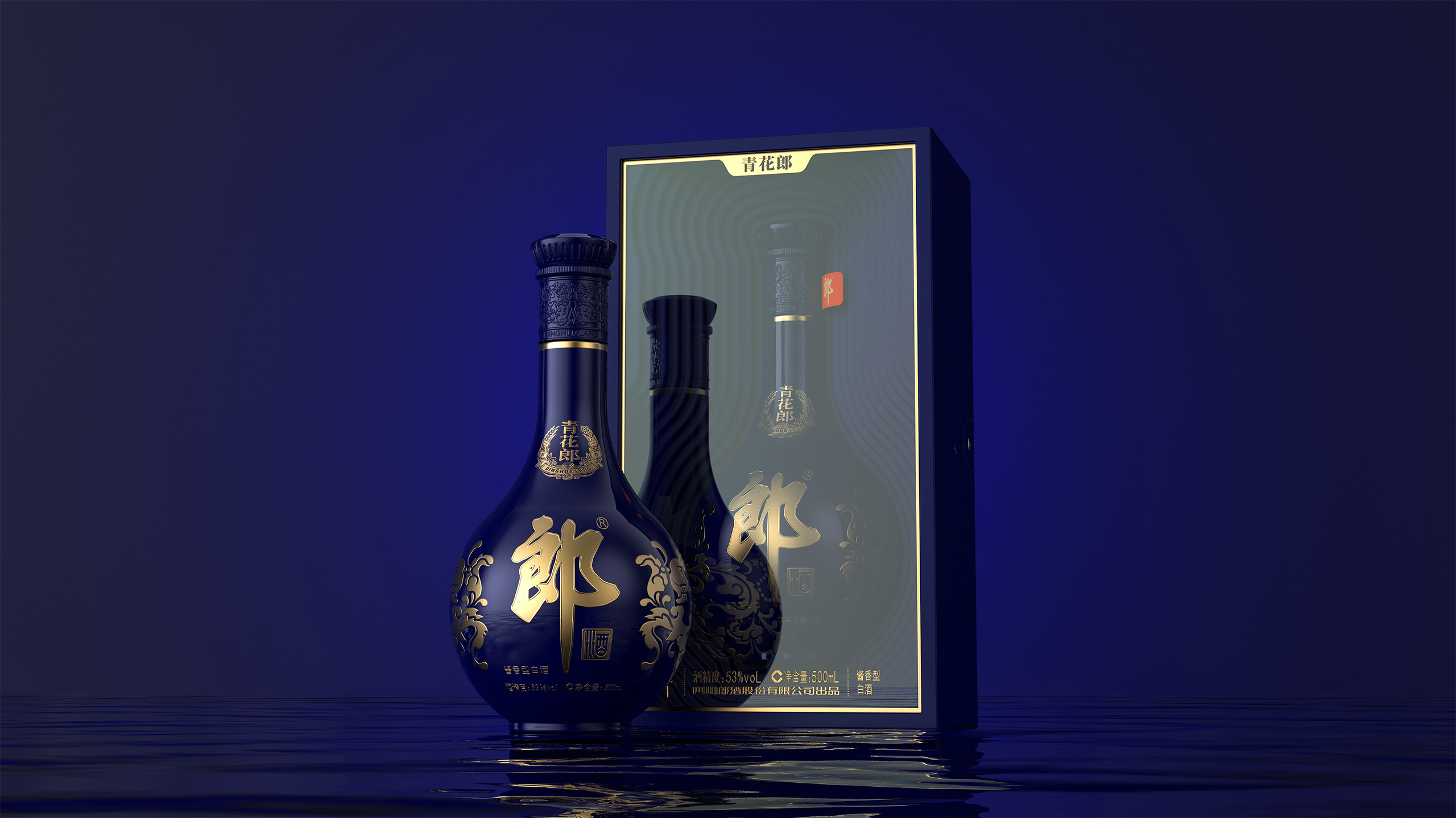
Qinghualang has been operating in the market for many years, and the brand symbol has long been deeply ingrained in people’s hearts. The overall design retains the original classic image and rethinks the product’s experience and cultural value.
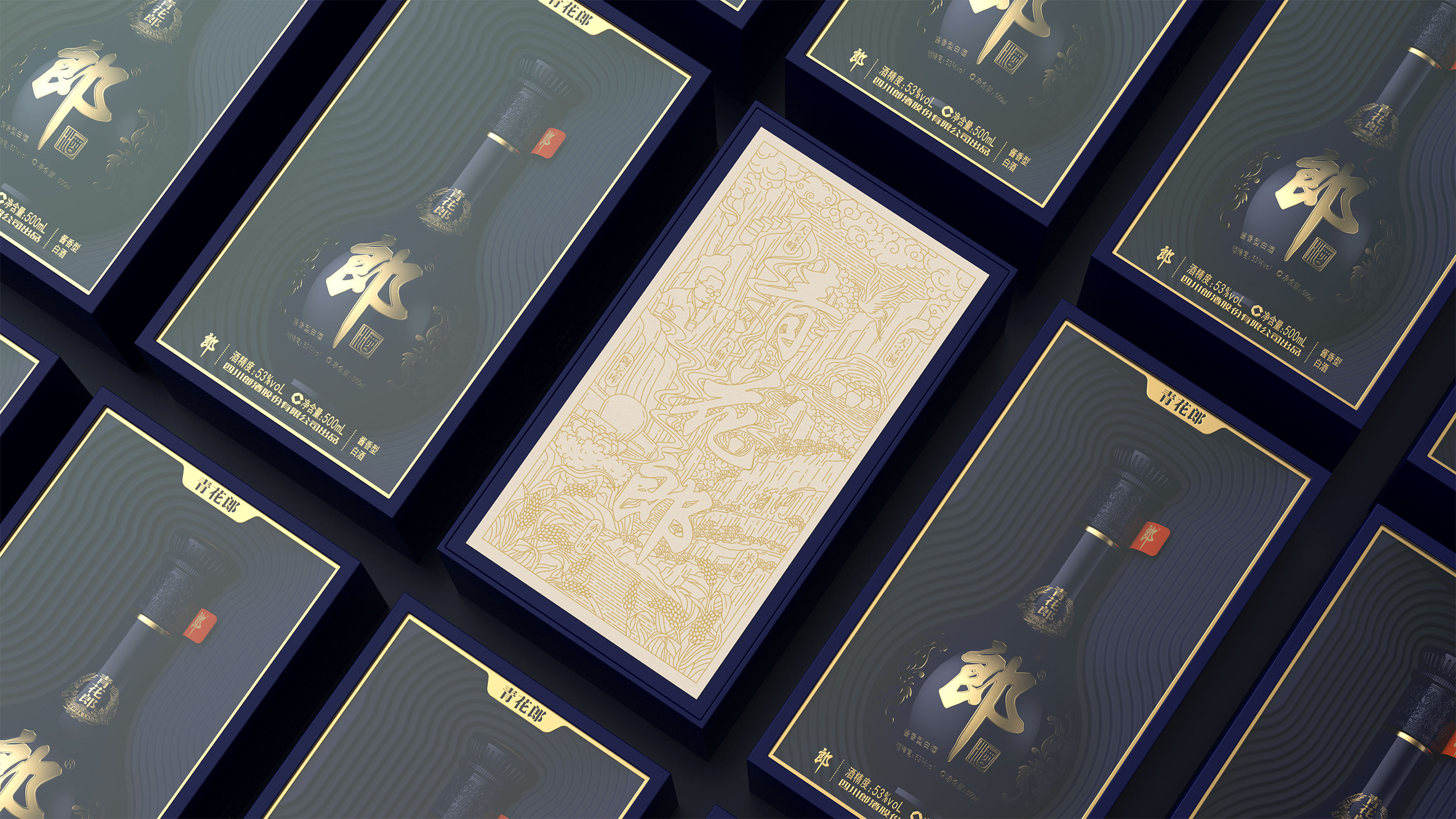
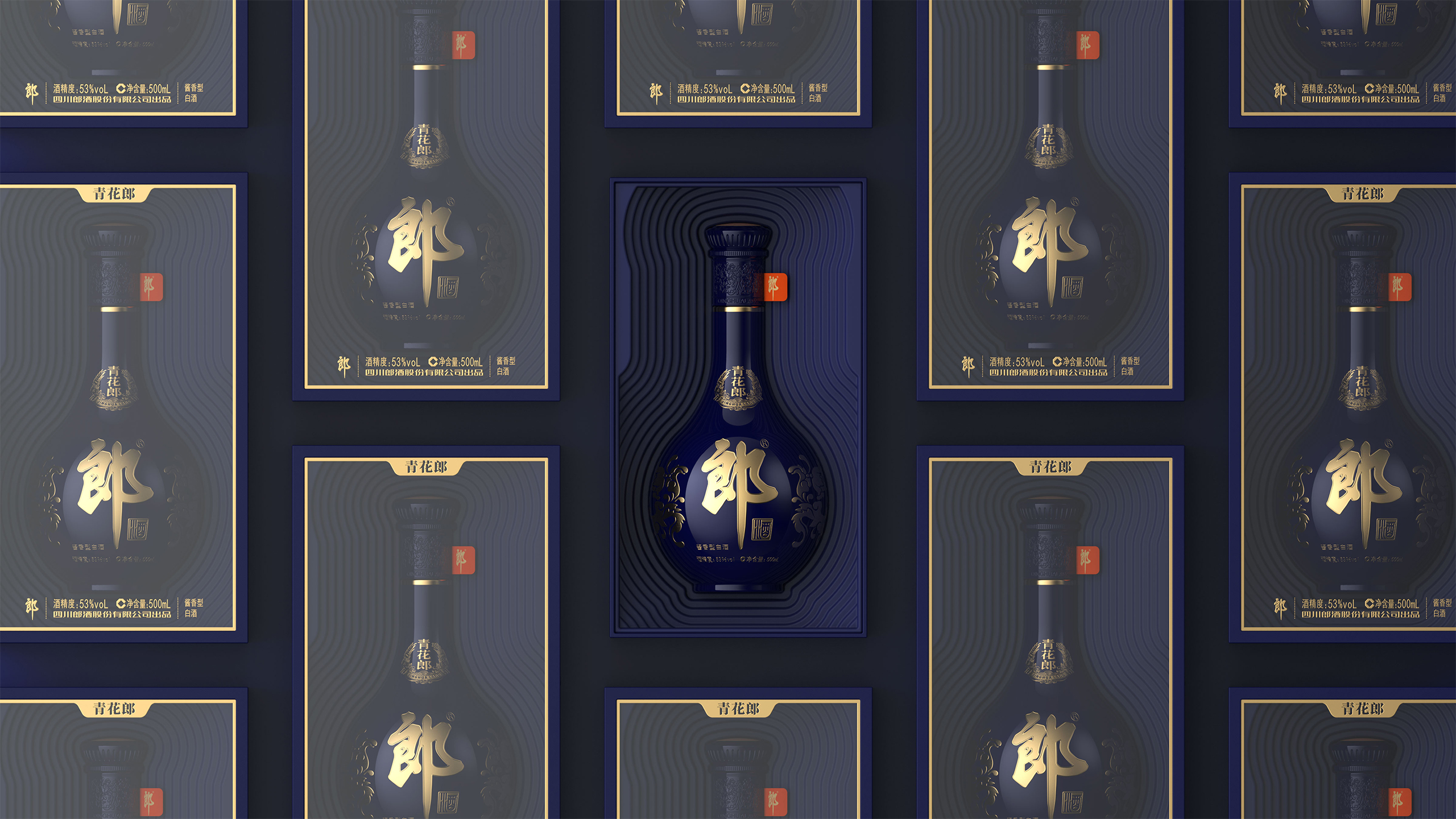
The main visual graphics combine the core elements of the estate sauce wine and empower it in the form of illustrations. The design adopts a heaven and earth cover box shape, with a circular sinking inner lining inspired by the unique circular terrain of Langjiu Manor’s Qianyi Hui Xiang Valley. The circular shape is constantly growing, which is conducive to the circulation and fragrance of the wine. This reflects the Blue and White Lang’s acceptance of heaven and earth, mellow and fragrant.
考虑到青花郎系列已在市场上运作多年,许多品牌自身符号也已深入人心,深受消费者喜欢。因此在设计过程中极大程度的保留了原有的经典形象,在产品的体验感和产品文化价值上重新思考。充分在产品的体验感和产品文化价值感上以及整个包装的品质感进行充分设计。从而增加消费者对产品及品牌的信任度。
主视觉图形将庄园酱酒核心元素相结合,以插图的形式进行赋能。采用天地盖盒型,内衬环状下沉造型灵感来源于郎酒庄园千忆回香谷独特的环状地形,环形生生不息,利于酒气循环回香。以此体现青花郎吐纳天地,醇化生香。


